Edmonton Humane Society
Logo Revision, Stickers, Posters, Post Cards, Magazine Ads, Annual Reports
Project Introduction
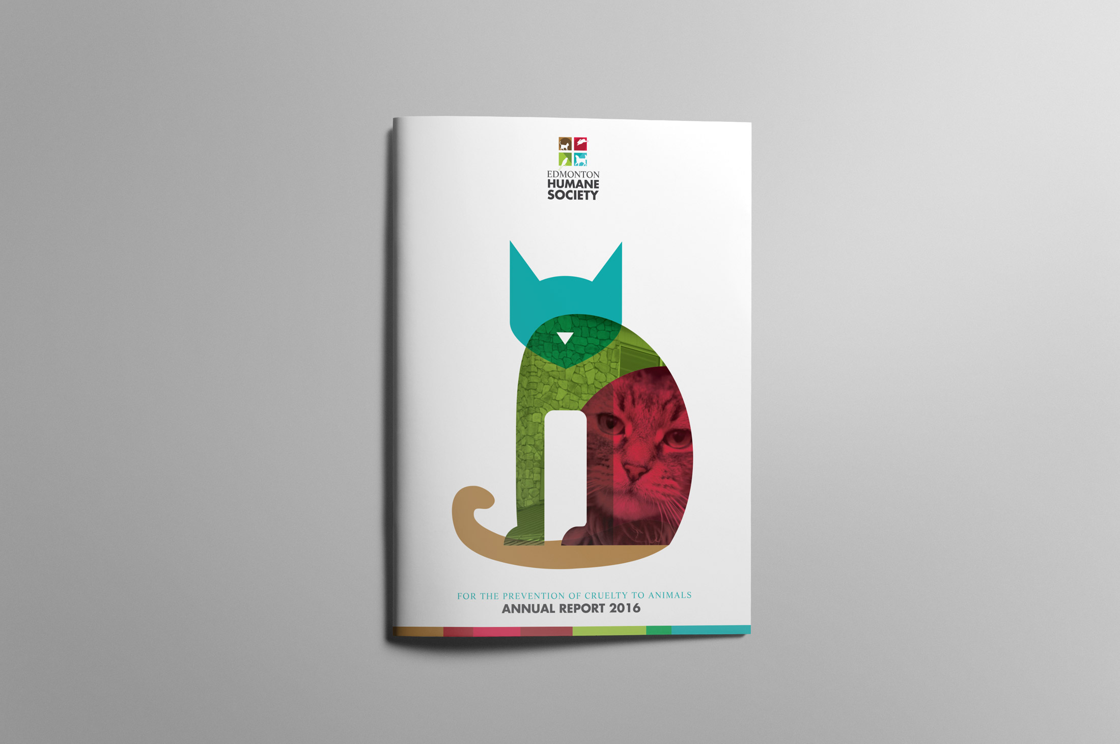
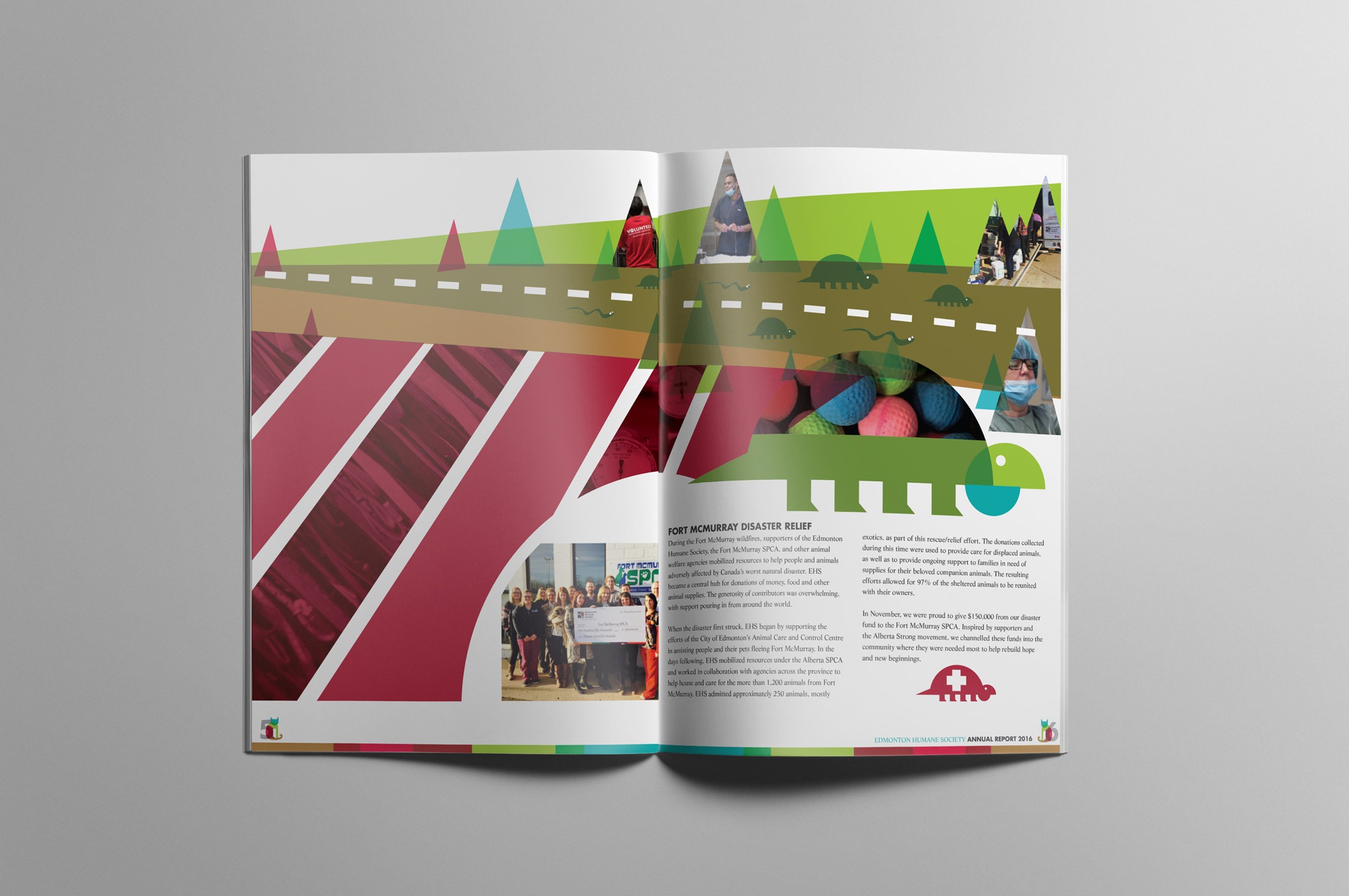
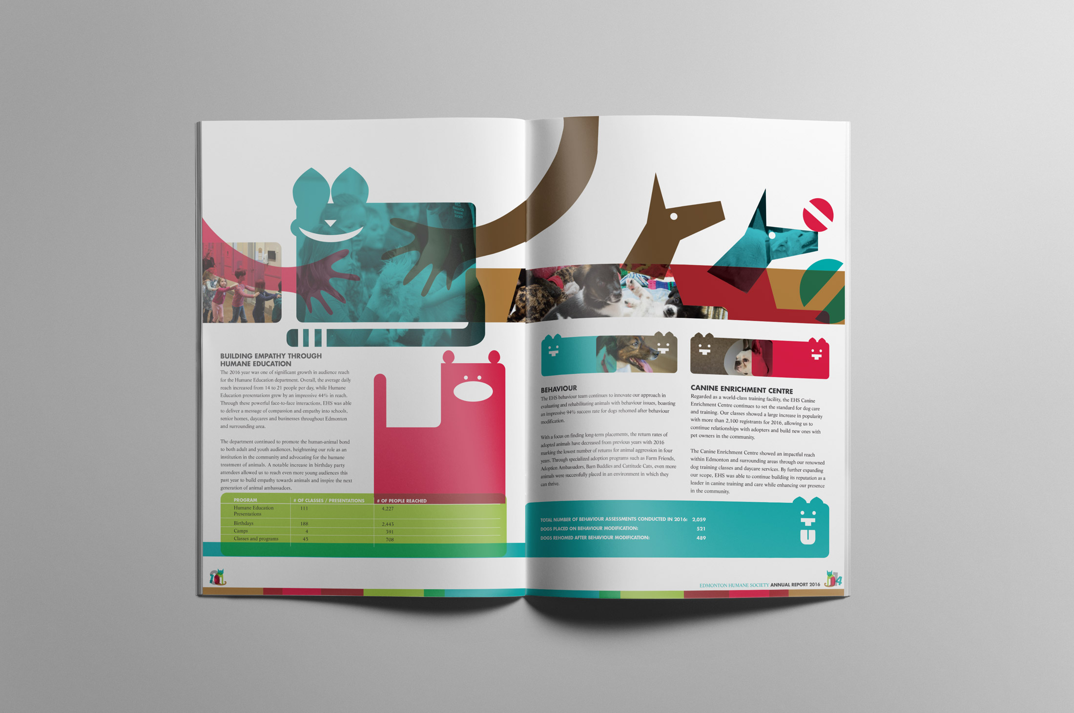
In this Annual Report Design - we focused on showing an animal, not as a whole photograph (as people would normally see it) but as a symbol created out of 4 slightly modified simple shapes. The reason for this is twofold: 1. the 4 shapes mimic the 4 squares in the EHS logo 2. the animal is made up of a digital collage of textures, photos and solid colours which symbolizes the fact that there is a lot more going on at EHS than animals in + animals out.
Specific Details
We wanted to take the focus off the single shot of animals and make it a more complex visual solution, by showing overlapping shapes that are translucent and having all shapes and parts overlap and merge - the individual pieces form a greater whole. Feel: building, flow, warmth,
Interesting Facts
Coming soon.